An example of what information design can do
Before
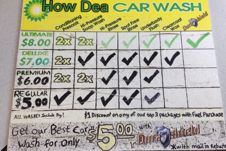
After
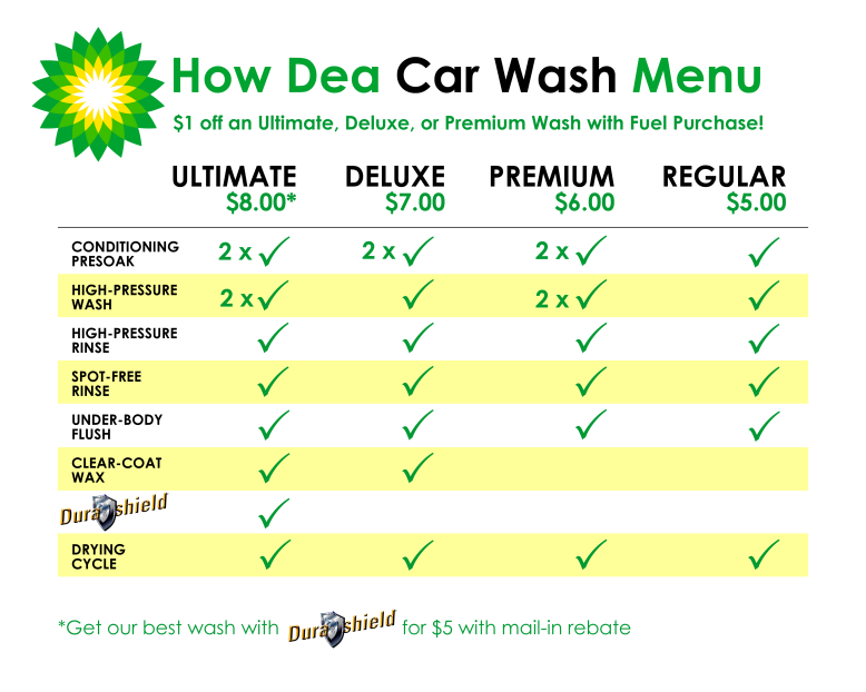
An example of what information design can do
One of a series of white papers by Elizabeth G. Fagan dba EGF Consulting.
One of a series of white papers by Elizabeth G. Fagan dba EGF Consulting.
Fagan contracted with Grainger.com as Senior User Experience Architect. She created wireframes for a subscription feature and for an award-winning persistent mini-cart and one-page checkout.
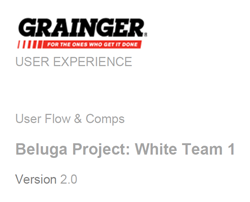
The Grainger.com UX management team challenged the its staff to create visions for different areas of the company’s website. Managers divided the staff into four teams, set a deadline, and the contest was on.
Fagan led her team (Beluga Project: White Team 1) to win the contest by creating the best concepts for a persistent mini-cart and one-page checkout.
Grainger.com Persistent Mini-cart and One-page Checkout wireframes PDF 1031
Fagan contracted with Grainger.com as Senior User Experience Architect. She created wireframes for a subscription feature and for an award-winning persistent mini-cart and one-page checkout.
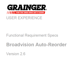
Grainger.com had contracted with an outside vendor to provide subscription functionality. Grainger.com required many more complex considerations than the vendor’s out-of-the-box functionality could handle.
As her team’s most-experienced member, Fagan became the project lead. She worked closely with the business stakeholders. She made sure back-end developers vetted the designs. She insisted on usability testing. In three months, she delivered the final document containing user flows, architecture, page designs, and content.
Fagan completed the project in the shortest amount of time in the vendor’s history. Grainger.com revenue increased dramatically following its Auto-Reorder launch.
Grainger.com subscription wireframes PDF 5874
One of a series of white papers by Elizabeth G. Fagan dba EGF Consulting.
Card sorting is a way to think about how users want or expect to see information on your website. Participants in a card-sorting session are asked to organize the content from your website in a way that makes sense to users. Participants review items from your website, and then they group the items into categories. They then label the groups, forming a new navigation structure.
Usually a card sort is performed with actual users, but you can perform a card-sorting exercise internally, with staff members.
Card sorting helps you build the structure for your website, decide what to put on each page, and label the navigation categories. It helps to ensure that you organize information on your website in a way that is logical and intuitive to your users.
There are two types of card sorts: an open card sort and a closed card sort.
In an open card sort, participants are asked to organize the cards into groups that make sense to them and then name each group. In a closed card sort, participants are asked to sort items into pre-defined categories.
An open card sort is typically done when you want to learn how users group content and understand the terms or labels users call each category. A closed card sort typically works best when you are working with a pre-defined set of categories and you want to learn how users sort content items into each category. A closed sort works well after an open sort. By conducting an open card sort first, you can begin to identify categories of content. You can then use a closed card sort to see how well the category labels work.
Each card sort represents an information architecture; the colored cards make up the navigation, and the white cards are the pages.
In cases where multiple participants perform sorts, there are different ways of analyzing the data. Complete site maps could be created in Visio or Excel. The cards can be pinned to a wall and reviewed. If you numbered the cards, you might use Excel to perform sorts. The website team should look for commonalities among the participants’ sorts.
Next steps are interface design and content development.
One of a series of white papers by Elizabeth G. Fagan dba EGF Consulting. This one was written for the Girl Scouts of Greater Chicago and Northwest Indiana.
The process of creating a website is frequently much more involved than what we are doing now. It can take a year or more to interview users, do usability testing, create designs, write content, development advanced features, and so on.
We are redoing this site on a shoestring, but that doesn’t mean we’re doing it wrong. The card-sorting activity and new navigation have been successful (as long as users can find what they’re looking for). This short report addresses how to create landing pages for the updated Girl Scouts of Greater Chicago and Northwest Indiana website, another important element to a redesigned website. The previous site lacked landing pages altogether.
Traditional retail sites have it easy. They know how to build their websites because they know what they want their websites to do. If they have a good Web marketing department, they can answer the following three questions without batting an eye:
The Girl Scouts of Greater Chicago and Northwest Indiana might not be able to answer those questions quite to so easily. Let’s look at these questions a little more closely.
Google analytics figures for our site say:
Marketing efforts such as improved Search Engine Optimization (ongoing), a non-profit YouTube channel, the Twitter widget, and other vehicles could be the subject of an entirely different report, generating its own efforts.
Here’s where the answer gets a more complex for the Girl Scouts of Greater Chicago and Northwest Indiana, because, aside from the retail store site, the main site does not sell products. What, then, does it “sell?” What is the desired action?
The site has four basic customer groups, all of whom are looking for different things. Think of the call to action for each group.
“Bounce rate” is the percentage of single-page visits or visits in which the person left your site from the entrance page. According to Google analytics, the bounce rate for the site is 60.74 percent. That’s high. The average number of pages viewed is 2.35 per visit. The average time on the site is one minute, 58 seconds. There’s a lot of room for improvement here, and good landing pages can help.
Landing pages are where more traditional marketing steps in. The best way to get visitors to act is to appeal to their fundamental emotional motivations. Notice I used the word “community” in all the desired actions. The role of the landing page is to create a sense of belonging, a powerful motivator—especially for a site like Girl Scouts of Greater Chicago and Northwest Indiana. They should contain a brief call to action.
The landing page should pick a few powerful topics from the pages below it and emphasize those. They should make emotional appeals, yet should be teasers—too many items on a Web page destroy the visitor’s ability to find key information. It paralyzes them from making a decision.
This is the role of the tertiary pages, or the pages below the landing pages. They contain the main content. They create the sense of community. They are positive and informational about the Girl Scouts. They contain the details of the calls to action.
Fagan contracted with Walgreens.com as User Experience Designer and worked on the company’s online pharmacy. Wireframes were created in Visio, Axure, and Photoshop.
![]()
Years on development teams taught Fagan the laws of customer-centric design. Most assuredly, interfaces designed without user input fail. The interfaces she advocates are inextricably linked to the user’s or customer’s perspective. But Fagan has seen too many user-centered web designs that are good looking but technically impossible. Her coding background informs her wireframing process. She vets wireframes with developers, saving time and money.
Walgreens.com Prescription Savings Club wireframes 1 PDF 5014kb
Fagan contracted with Walgreens.com as User Experience Designer and worked on the company’s online pharmacy. Wireframes were created in Visio, Axure, and Photoshop.
![]()
Years on development teams taught Fagan the laws of customer-centric design. Most assuredly, interfaces designed without user input fail. The interfaces she advocates are inextricably linked to the user’s or customer’s perspective. But Fagan has seen too many user-centered web designs that are good looking but technically impossible. Her coding background informs her wireframing process. She vets wireframes with developers, saving time and money.
